
Helping businesses choose an MYOB accounting product
Role
End-to-end UX including user research, usability testing, synthesis, user flow, lo/hi-fi wireframes, prototyping, user interface design, interaction design
Duration
6 weeks
Team
Newly assembled optimisation team of 3 consisting of a product owner, developer and UX designer)
Tools
Sketch, inVision, Adobe Target, Adobe Analytics

The problem
MYOB offers SMEs 9 different products across 3 different product families. The comparison page only shows two of those families, leaving off the lowest pricing tier.
SME prospects looking to choose a product have to navigate multiple pages in order to make a decision, making it nearly impossible to differentiate between features.
As you can imagine this is not a pleasant journey for customers, who are essentially left to fend for themselves.
How might we remove ambiguity and the effort required for SMEs to find the right product?


The design process
Understand
Together with the team, we started understanding the logic that would eventually would drive our product recommendation.
This was an essential step in understanding which software features were common across the suite, or unique to that product.
Define
Once we had mapped out this feature-driven logic in the form of post-it notes, I made a quick digital version for our reference and started creating some user flows to get a feel for how a user might interact with our recommendation tool.
It was important to understand how the 9 products matched up to one another, and to be clear about which features/limitations were dependent in giving each one of the product recommendations.


Ideate
We put together a small group of people including members of our team, to do some sketching sessions. Here we could bring our ideas to the table and together work out how we might go about designing and building a prototype.
Having such a lean team, we were able to start testing with a prototype by week 3.


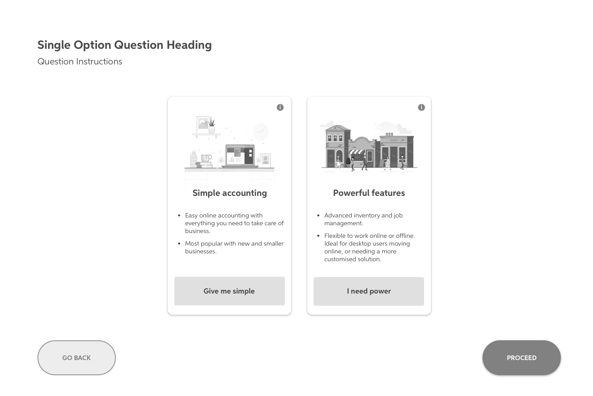
Validating the design
I was able to arrange 7 small business owners to come in and be interviewed to complete some usability testing of the final design.
The original approach was to drop participants straight into the prototype, and once they had a feel for it then determine where or how we should introduce this into the website.
About halfway through research, I pivoted on this slightly, instead creating a scenario starting at the home page through to choosing a product.
Both had their benefits, but in the end I feel the natural shopping mindset of arriving somewhere and then looking for the right product seemed the most suitable.
We captured all observations on post-it notes, and then eventually transferred them to Airtable for synthesis.
